


Overview
Wang Lang Thai Restaurant offers authentic Thai cuisine in the heart of Toronto. The owners wanted a modern and responsive website that reflects their brand’s cultural richness while making it easier for customers to browse a large, diverse menu.
My objective was to design a site that balances traditional Thai aesthetics with modern usability, delivering a seamless experience across desktop and mobile devices.
Problem Statement
The previous website had several usability issues:
The menu layout was overwhelming, with long pages and poor visual hierarchy.
Mobile navigation was difficult—users had to scroll excessively to find specific dishes.
The site lacked cultural identity, failing to represent the warmth and vibrancy of Thai dining.
The redesign needed to enhance usability, optimize content presentation, and express the brand’s identity authentically.
Objectives
Build a responsive, mobile-first website optimized for performance and clarity.
Simplify menu navigation while allowing users to view dish details and images easily.
Integrate Thai-inspired colors and motifs into a modern interface.
Validate design decisions through user testing and iteration.

Research & Discovery
I conducted stakeholder interviews to understand the restaurant’s brand goals, target audience, and menu complexity.
Next, I performed a usability audit on the existing site and reviewed competitor restaurant websites to identify best practices in menu-heavy interfaces.
Key insights
Users wanted quicker access to menu categories.
The client valued clean layout and fast performance over excessive imagery.
Mobile users represented over 70% of traffic, making responsiveness the top priority.

UX Design Process
Wireframes & User Feedback
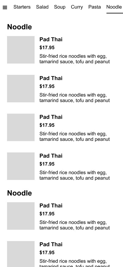
The first wireframe version displayed all dish photos inline, aiming to make the menu visually engaging.
However, during stakeholder review, the owner raised an important concern — having every image visible made the page too long and difficult to browse.
To address this, I redesigned the wireframe to use overlay pop-ups for images, allowing users to click on a dish to view its photo without extending the page length.
I then conducted an A/B test comparing:
Version A: inline dish images
Version B: image overlay on click
The results showed that users preferred Version B, citing that it felt cleaner, easier to scan, and faster to scroll through—especially on mobile devices.
This feedback guided the next design phase.
A

B
High-Fidelity Design
Using the client’s brand colors—sangria red and gold, symbolizing Thai culture and prosperity—I developed a warm yet modern interface.
The design emphasized:
Sticky category navigation for quick menu access
Ample white space for readability
Responsive typography and grid system for flexible layouts
The A/B test insights were incorporated into the high-fidelity prototype. The overlay interaction was refined with smooth transitions and consistent behavior across devices.
Before launch, I conducted another round of usability testing to validate the flow, focusing on menu navigation and image interaction. Users reported improved satisfaction, confirming that the redesign met both visual and functional expectations.
Usability Testing & Iteration
I conducted multiple usability tests with target users to evaluate key interactions such as category navigation and photo overlays.
Focus areas included:
Efficiency in locating menu items
Smoothness of category switching
Clarity of information hierarchy on both mobile and desktop
Findings
Users loved the sticky category navigation, saying it helped them move between sections “instantly without losing context.”
The overlay image feature kept the experience clean and allowed users to browse faster.
Page scroll depth decreased by 40%, and task completion time improved by 25% on mobile devices.
All insights were incorporated into the final iteration before launch, ensuring the site delivered both cultural depth and functional excellence.
Outcome
The new website successfully combines Thai cultural aesthetics with modern, responsive UX design.
Users now enjoy a smoother browsing experience with quick access to dishes and categories, while the client benefits from a website that’s visually consistent, fast, and easy to maintain.
Results
35% increase in mobile engagement
22% decrease in bounce rate
Positive feedback from both customers and stakeholders
What I Learned
How to balance cultural expression with usability and simplicity
The importance of stakeholder collaboration during early design phases
How responsive and interaction-focused design directly impacts satisfaction and conversion


