Project
Design Exercise for the Visual Designer Role at CarriersEdge
Role
UX/UI Designer
Visual Designer
Illustrator
A UX/UI case study on transforming a complex, outdated form into a modern, user-friendly, and engaging experience.
The Brief: To redesign the existing questionnaire page to be more modern, user-friendly, and responsive, based on provided brand guidelines.
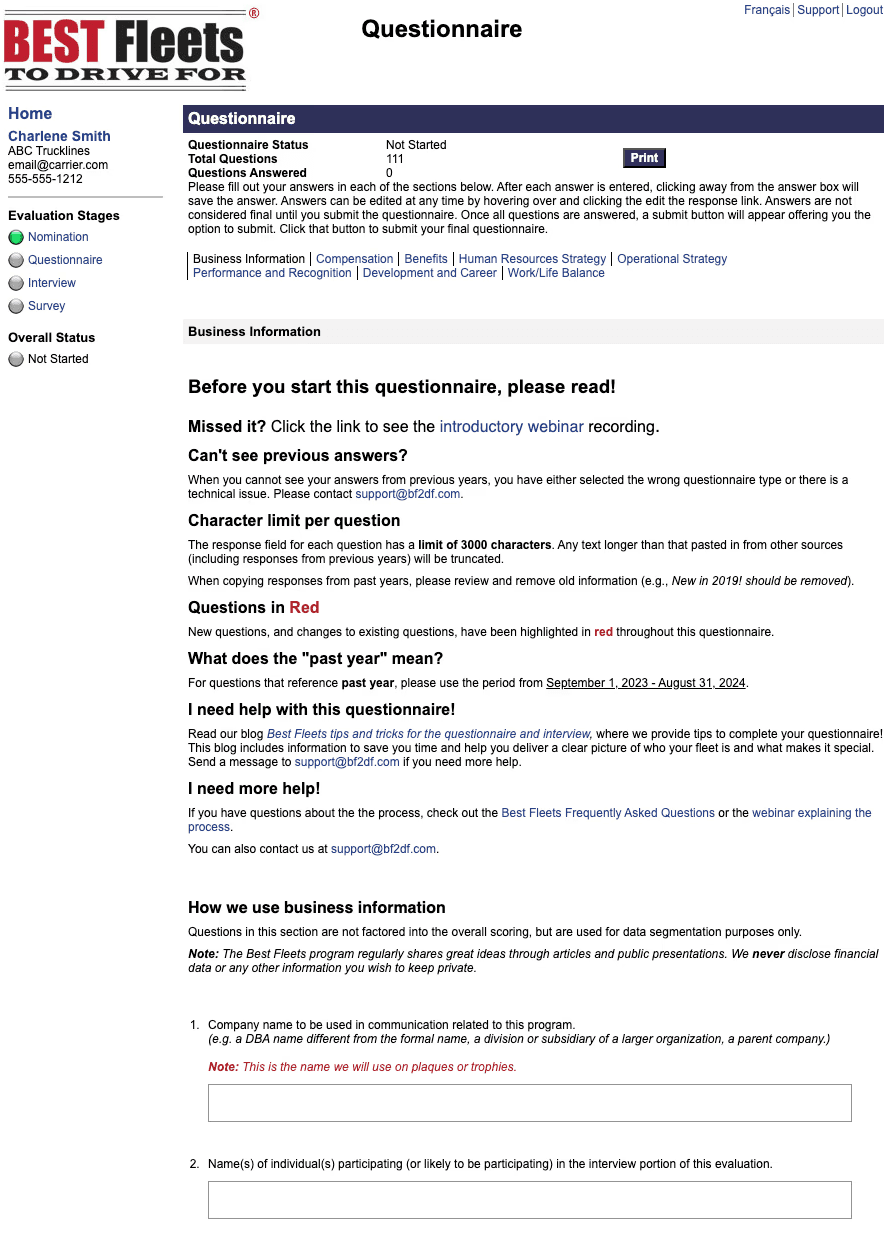
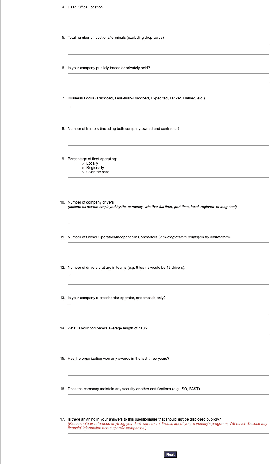
The original questionnaire, while functional, presented several key usability challenges that could lead to user frustration and potential drop-offs. My initial analysis identified three main pain points:
Cognitive Overload: A single, long page with over 17 questions felt intimidating and created a significant mental load for the user, making the task seem more daunting than it needed to be.
Lack of Guidance: With no clear progress indicators or logical grouping of questions, users could easily feel lost and unsure of how much work was remaining.
Outdated UI: The visual design felt dated, which could potentially undermine the brand's credibility and professionalism.
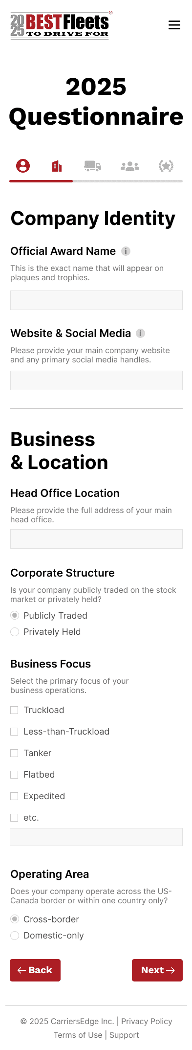
Lack of Responsiveness: The original design was not created for mobile screens, making the user experience on devices other than a desktop very poor and inconvenient.
My goal was to transform this process from a chore into a smooth, guided journey. I focused on three core principles:
Simplify Through "Chunking": Break down the long form into smaller, logical sections to make it feel manageable and easy to complete.
Guide the User: Implement clear navigation and progress indicators to ensure users always know where they are and what to do next.
Modernize & Build Trust: Create a clean, professional, and on-brand visual experience that is both beautiful and trustworthy.
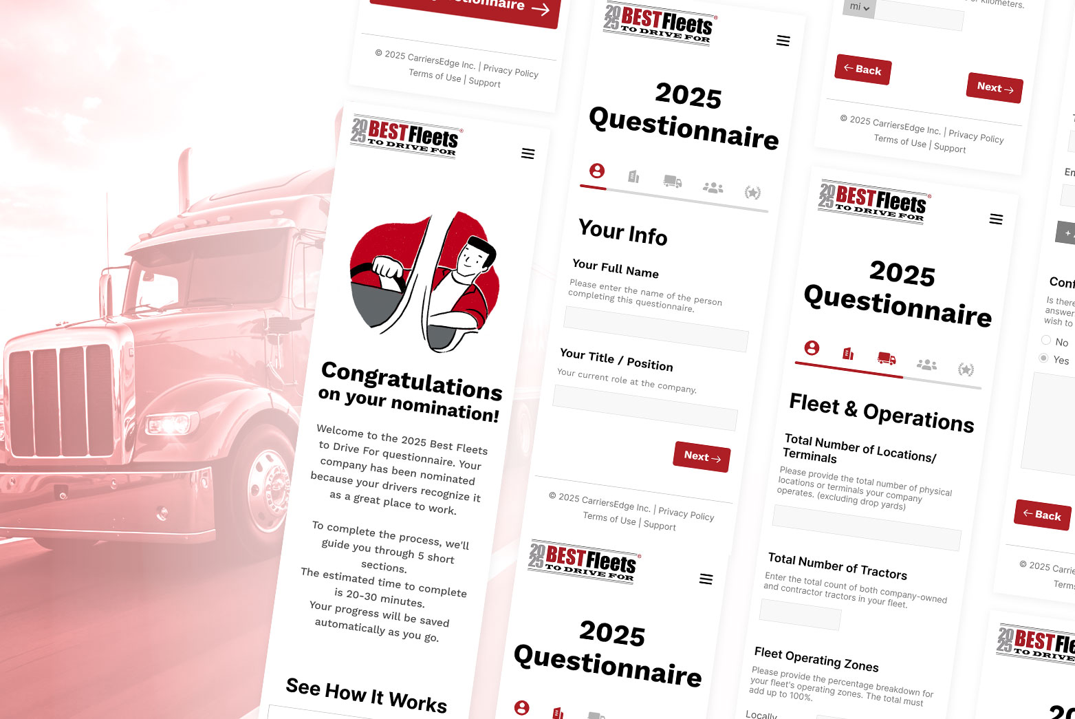
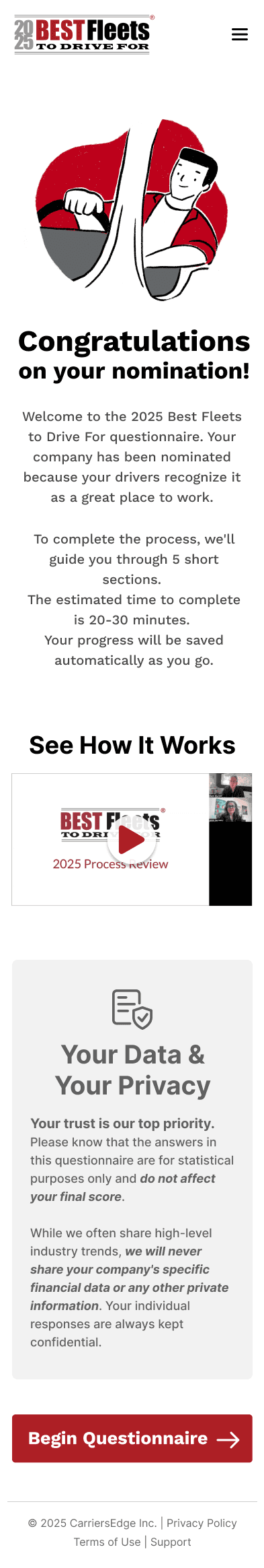
The redesign introduces a completely new, structured user flow, starting from the moment the user lands on the page.
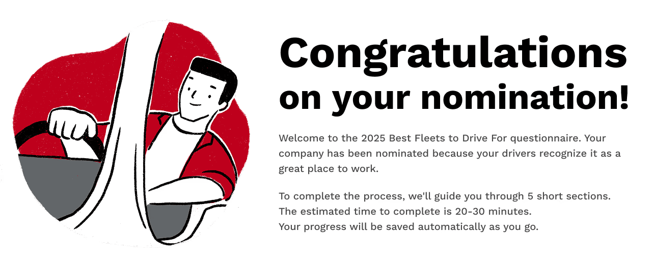
Instead of immediately presenting a form, the new journey begins with a dedicated Welcome Screen.
This page serves several key functions:
Creates a Positive Tone: It congratulates the user on their nomination, making them feel valued.
Manages Expectations: It clearly states the number of sections (5) and the estimated completion time (20-30 mins).
Builds Trust: A dedicated section on "Your Data & Your Privacy" reassures the user that their sensitive information is safe before they even begin.
Provides Help: A prominent link to a video guide offers support for users who may need it.

The core of the redesign is a multi-step progress bar that turns the intimidating form into five manageable "mini-quests."
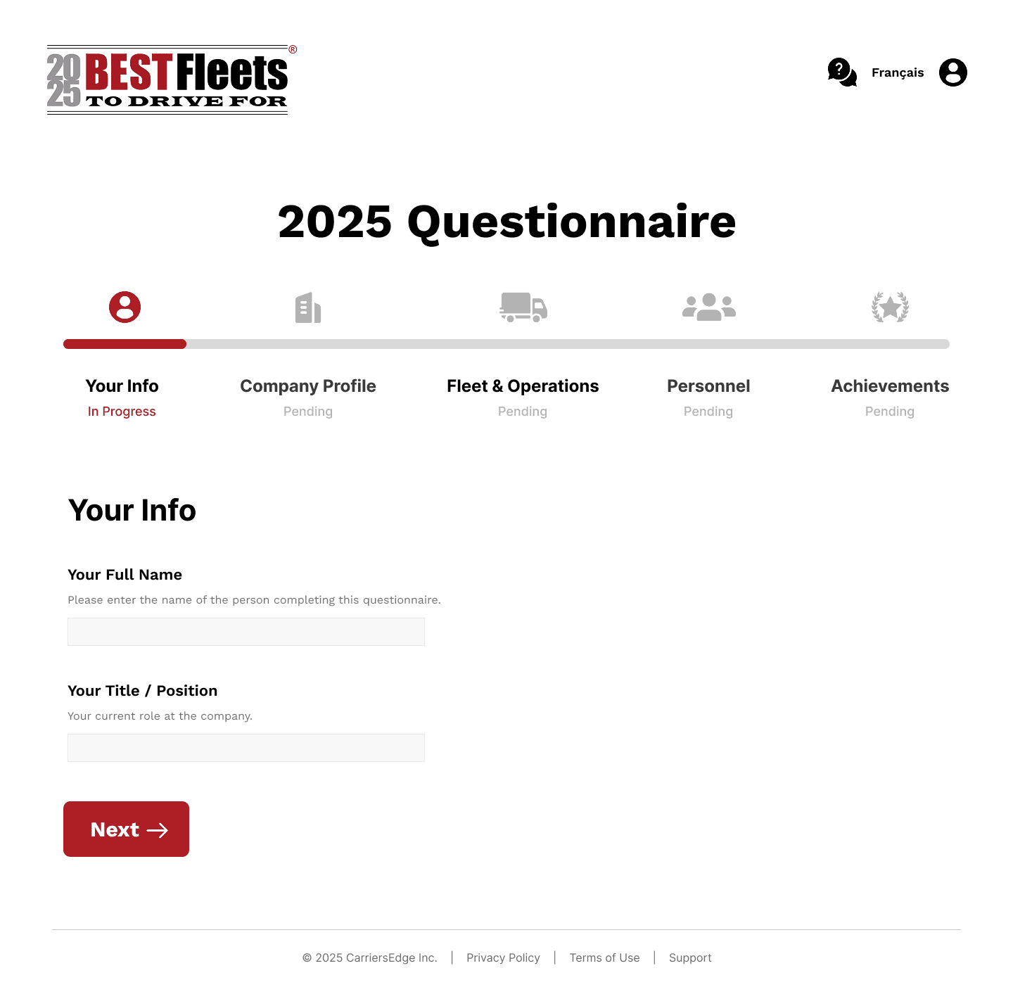
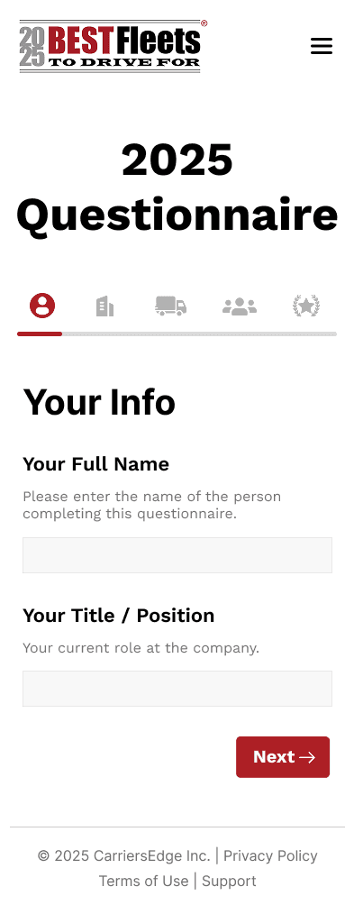
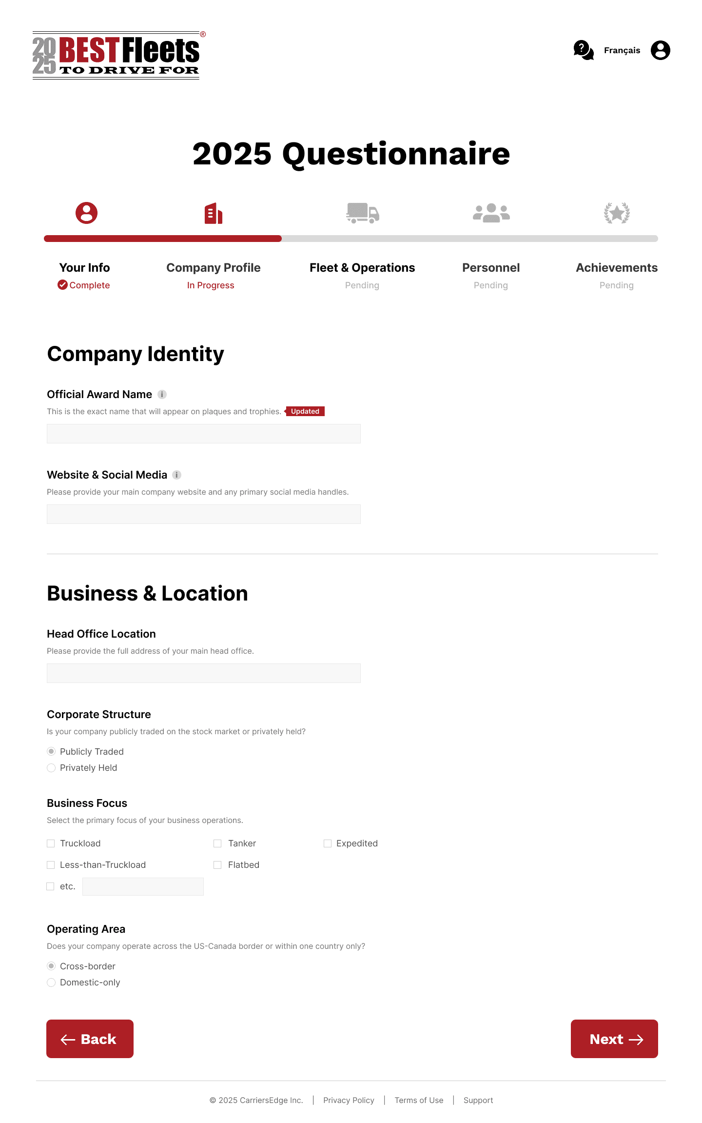
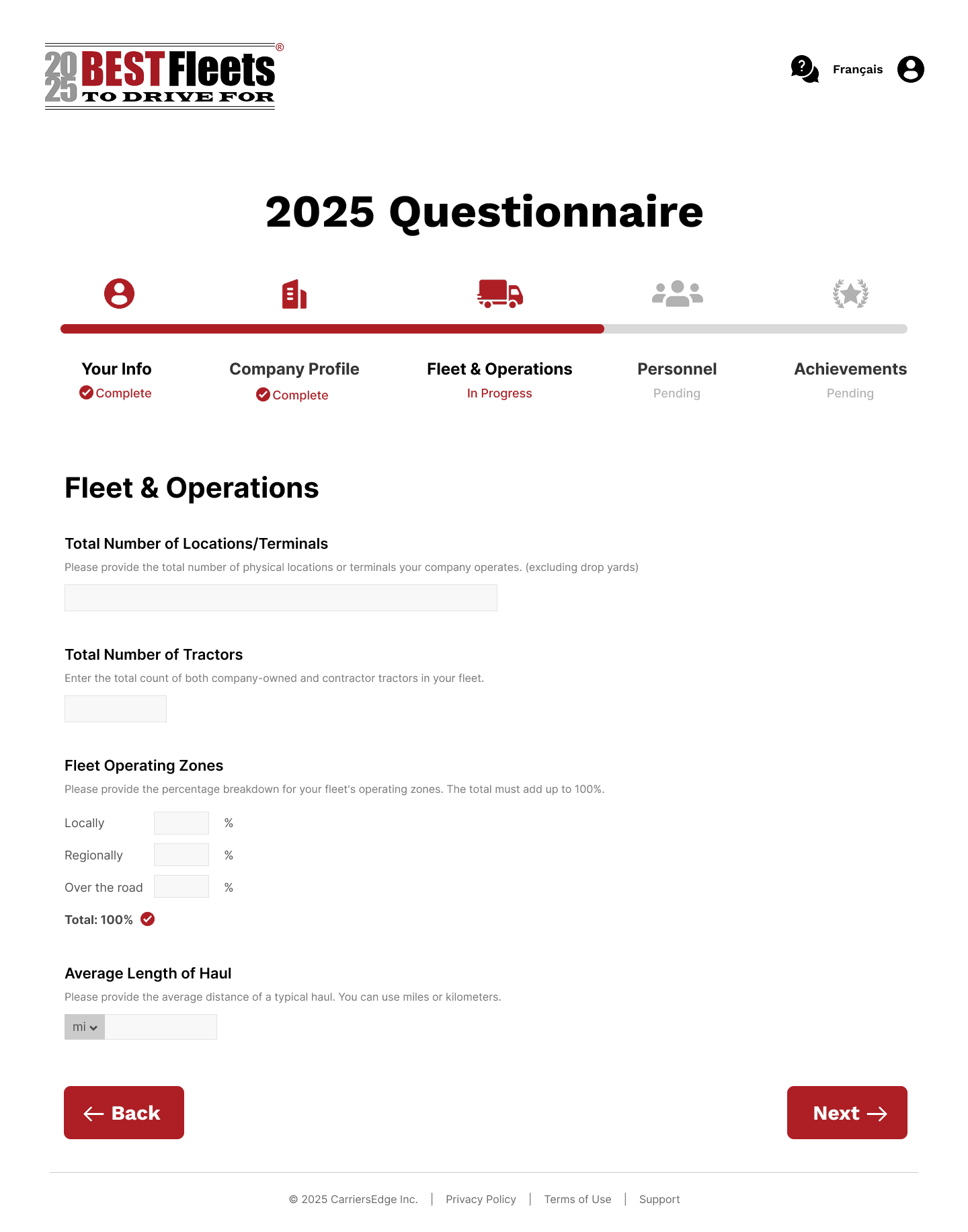


Clear Progress: The stepper visually communicates where the user is, what they've completed, and what's next, reducing anxiety and creating a sense of accomplishment.
Logical Grouping: Questions are now grouped into logical sections (Company Profile, Fleet & Operations, Personnel, etc.), allowing users to focus on one type of information at a time.
Smart UI Components: For complex inputs, I designed user-friendly solutions like the integrated unit selector for "Average Length of Haul" and the repeatable fields for adding multiple interview contacts, which simplifies the process and ensures data quality.
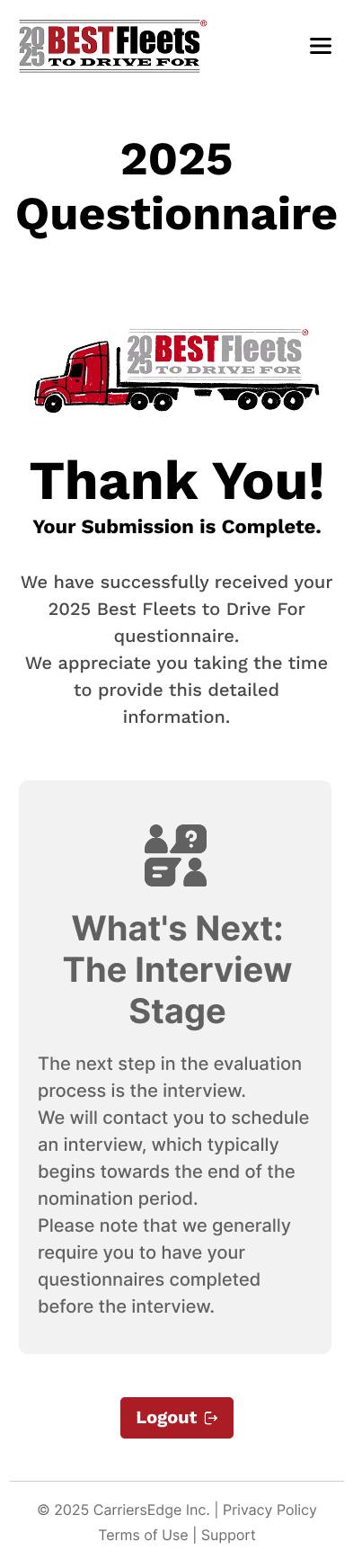
To elevate the experience and reflect my unique skills as an illustrator, I introduced custom illustrations. These visuals, placed at the beginning and end of the journey, add brand personality, create a friendly tone, and provide a delightful visual reward, transforming the experience from a standard form into a memorable brand interaction.
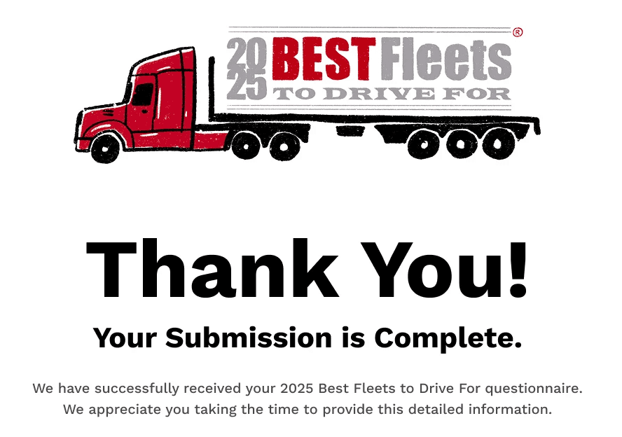
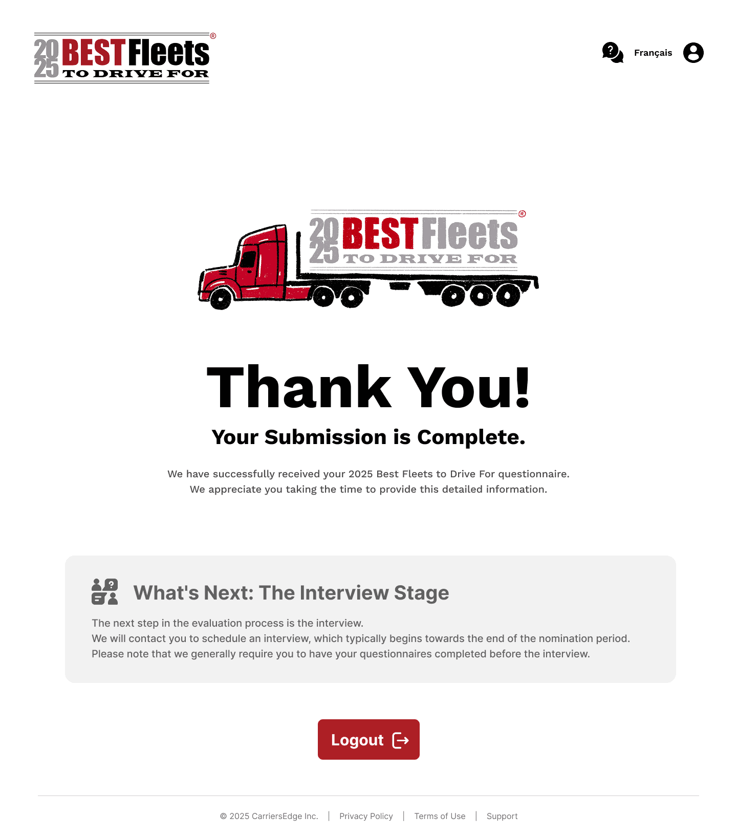
The journey concludes with a clear success page. It confirms that the submission is complete, reiterates the next steps in the process, and provides a clear "Logout" action, leaving the user with a sense of closure and satisfaction.
To truly demonstrate the user flow and interactions, I created a high-fidelity prototype in Figma. This video showcases the seamless, step-by-step journey for both desktop and mobile users—from the welcoming start, through the guided questionnaire, to the final confirmation.
Please notice the clear state changes in the progress bar, the responsive adaptation of the layout on the mobile view, and the intuitive UI components designed to make the process as effortless as possible.
The final result is a user-friendly, trustworthy, and professional experience that directly solves the problems of the original design.
From Overwhelming → To Manageable: The single, long form is now a 5-step guided process.
From Confusing → To Clear: A progress bar, contextual help (
( i )icons), and well-written microcopy now guide the user at every step.
From Outdated → To On-Brand & Professional: The new, clean UI, combined with custom illustrations, enhances the "Best Fleets to Drive For" brand perception and builds user trust.
For a closer look at all the individual screens, I've organized the final high-fidelity mockups for both desktop and mobile versions into a shared folder.